Designing, rendering, and printing a wall-sized map of London
- Outline
- Getting the data
- Projection & coordinate maths
- The Python approach and why it failed
- Rust rewrite as “ETL”
- Streaming parser V2
- Speeding up serialization using rkyv
- Converting the polygon reordering alg to Rust
- Improving rendering time in raqote
- Fixing font rendering in raqote
- Configuring raqote colours in a json config
- Rendering non-overlapping tube lines
- Overflow bugs and tiling / Icons by loading a PNG by hand and dealing with obscure bugs
- Printing the map
- Takeaways
- The map
Outline
Some time in August 2023, I started getting excited about my upcoming move to London. Whenever I move, I like to put up a map of the place I’m moving to on a wall somewhere. It helps me get a feeling for the place, and maps on walls is an aesthetic I enjoy. Since I knew I’d be staying in London for at least a few years, I wanted something more permanent.
I looked around for options, but maps tended to have the wrong level of detail for my needs. On the one hand, there were many decorative ones in places like Etsy, which looked nice, but didn’t show functional information like tube stops. On the other hand, there were functional maps like the ordnance survey, or OSM or Google Maps. These contain too much information that I’m not interested in. Google maps in particular is very commercial, which is not something I want on my bedroom wall.
Since I wanted to make this a very personal artefact, hopefully layering many years of personal notes onto the initial print, I decided to render it myself, from raw data.
Ominous thunder rumbles in the background.
The initial idea was to print it on acrylic glass, so that I could draw on it directly with permanent markers. I wanted the map to cover a large part of London in sufficient detail to distinguish individual roads, and I had a specific place on my wall I wanted to fill, so I went for 100x70cm. That sort of print costs about £1k, so instead I settled on a framed print on photographic paper, for about a quarter of the price.
This post describes the whole project and it’s many challenges and iterations. I was planning to have the map finished by September 2023. I’m writing this in December 2024. I want to share what I have learned, but also I want to understand why this project was so much larger than I initially anticipated.
Even the writeup itself is among the longest posts I’ve written so the editing might have gotten a bit less care than it fully deserves. Some of the performance numbers were hard to reproduce so I pulled them out of my tried to recall them as best I could. Take any number in this post, especially a time, with a chunky grain of salt.
Getting the data
I decided that my underlying data source should be the OSM dataset. I downloaded all of London from osm.org into a 120M planet_-0.418,51.37_0.268,51.647.osm.xz file. Decompressing with gzip yields a 1.2G file which starts like this:
<?xml version='1.0' encoding='UTF-8'?>
<osm version="0.6" generator="osmconvert 0.8.11" timestamp="2023-06-09T00:00:00Z">
	<bounds minlat="51.37" minlon="-0.4179999" maxlat="51.647" maxlon="0.268"/>
	<node id="78112" lat="51.526976" lon="-0.1457924" version="1"/>
	<node id="99878" lat="51.524358" lon="-0.1529847" version="1">
		<tag k="access" v="permissive"/>
		<tag k="barrier" v="gate"/>
		<tag k="bicycle" v="no"/>
		<tag k="motor_vehicle" v="no"/>
		<tag k="opening_hours" v="dawn-dusk"/>
		<tag k="wheelchair" v="yes"/>
	</node>
...
This fragment defines the metadata of the export, as well as the first two nodes. OSM has three basic data types. First there are nodes, which are just points with coordinates and tags. These can be building blocks for the two other data types, and/or they describe information about small real world artefacts without a specified geometry like shops, trees, or, in the example above, a gate which can be crossed in a wheelchair and which is open from dawn ‘till dusk.
Second, there are ways, which are ordered lists of nodes, referenced by their node id. These represent either paths (train tracks, roads, parts of an administrative boundary) and/or polygons (buildings, lakes, small parks).
And finally, there are relations, which are ordered lists of nodes, ways, and/or other relations. These represent more complex objects like bigger parks, buildings with many parts, train stations (comprising exits, platforms, stops of different public transport modes), countries, large rivers with complex geometry, and many other things.
Nodes, ways, and relations can have metadata tags, which are just key-value pairs. They give the geometry meaning.
As of February 2024, OpenStreetMap contains over 96 thousand distinct keys and over 155 million distinct tags.
~ OSM Wiki
Here is King’s Cross Station:
<relation id="7672055" version="1">
<member type="relation" ref="1569863" role=""/>
<member type="relation" ref="1569970" role=""/>
...
<member type="relation" ref="205677" role=""/>
<member type="relation" ref="3803720" role=""/>
<tag k="name" v="King's Cross St Pancras"/>
<tag k="public_transport" v="stop_area_group"/>
<tag k="public_transport:version" v="2"/>
<tag k="type" v="public_transport"/>
</relation>Where the first linked relation is:
<relation id="1569863" version="1">
<member type="way" ref="945776388" role="platform"/>
<member type="node" ref="7159162454" role=""/>
<member type="way" ref="260720558" role=""/>
<member type="node" ref="1270402385" role="stop"/>
<member type="node" ref="1270402390" role="stop"/>
...
<member type="node" ref="1270404737" role="stop"/>
<member type="node" ref="1270404739" role="stop"/>
<member type="way" ref="68288682" role="platform"/>
<member type="way" ref="68287391" role="platform"/>
...
<member type="way" ref="68285896" role="platform"/>
<member type="way" ref="111571259" role="platform"/>
<member type="node" ref="4293783717" role=""/>
<member type="node" ref="4294478732" role=""/>
<member type="node" ref="4293783719" role=""/>
<member type="node" ref="4293783721" role=""/>
<member type="node" ref="4294478733" role=""/>
<member type="node" ref="583588665" role=""/>
<member type="node" ref="4293783722" role=""/>
<tag k="name" v="King's Cross"/>
<tag k="public_transport" v="stop_area"/>
<tag k="public_transport:version" v="2"/>
<tag k="rail" v="yes"/>
<tag k="type" v="public_transport"/>
</relation>My export contained a total of 7,814,688 nodes, 1,551,828 ways, and 28,981 relations.
Having a searchable OSM dataset is awesome. I can look up metadata for any place I like in my text editor (thank you to vim for not bulking at a 1.2 GB text file). I can also grep through it to get a list of all religions with sites of worship in London:
grep 'k="religion"' planet_-0.418,51.37_0.268,51.647.osm | sort | uniq | cut -d'"' -f4 | columnaetherius_society jewish scientologist
buddhist multifaith self-realization_fellowship
christian muslim sikh
hindu none spiritualist
humanist rastafarian
jain rosicrucian
Or all the leisurely activities used to tag a place:
grep 'k="leisure"' planet_-0.418,51.37_0.268,51.647.osm | sort | uniq | cut -d'"' -f4 | columnadult_gaming_centre amusement_arcade area bandstand
beach_resort bicycle_training bingo bird_hide
bleachers board_game boating bouldering
bowling_alley club clubhouse comedy
common construction cycle_park cycling
dance dog_park escape_game exercise_area
firepit fishing fitness_centre fitness_station
garden girl_guides golf_course green
gymnasium hackerspace high_jump high_ropes_course
horse_riding ice_rink indoor_play karaoke
long_jump marina market maze
miniature_golf music_venue nature_reserve nets
outdoor_fitness outdoor_seating paddling_pool park
parklet picnic_bench picnic_table pit
pitch playground practice_pitch racetrack
recreation_ground sauna school_playground schoolyard
sheltered_seating slipway social_club spa
sports_centre sports_hall sports_pavillion sports stand
stadium swimming_area swimming_pool table_tennis_table
tanning_salon terrace track trampoline_park
turkish_bath wall water_park yes
If spending some time in the fire pit of leisure sounds fun to you, email me.
Data issues
The data quality in OSM for London was honestly much better than I expected.
I encountered a few snags, mostly around the tagging of tube lines and places I knew. I submitted some patches to the dataset but built in lots of custom workarounds to iron out inconsistencies in tagging:
let lines = match line_tag.to_lowercase().as_str() {
    "bakerloo" => vec![TubeLine::Bakerloo],
    "central" | "central line" => vec![TubeLine::Central],
    "circle" => vec![TubeLine::Circle],
    "deep level district" | "district" | "district, north london" => vec![TubeLine::District],
    "district, piccadilly" => vec![TubeLine::District, TubeLine::Piccadilly],
    "dlr" => vec![TubeLine::Dlr],
    "elizabeth" => vec![TubeLine::Elizabeth],
    "hammersmith & city" => vec![TubeLine::HammersmithAndCity],
    "jubilee" | "jubilee line" => vec![TubeLine::Jubilee],
    "metropolitan" => vec![TubeLine::Metropolitan],
    "metropolitan, piccadilly" => vec![TubeLine::Metropolitan, TubeLine::Piccadilly],
    "north london line" => vec![TubeLine::Overground],
    "northern" | "northern line" => vec![TubeLine::Northern],
    "northern city" => vec![TubeLine::Northern, TubeLine::HammersmithAndCity],
    "picadilly" | "piccadilly" => vec![TubeLine::Piccadilly],
    "victoria" => vec![TubeLine::Victoria],
    "waterloo & city" => vec![TubeLine::WaterlooAndCity],
    _ => {
        vec![]
    },
};

...

if way.id == 963992061 {
    output.landmarks.push(
        Landmark{
            lon: way.nodes[0].lon,
            lat: way.nodes[0].lat,
            landmark_type: LandmarkType::ClimbingRope,
        }
    );
}
Even though OSM updates quickly after patches are submitted, I wanted to work off of a fixed state, so that I wouldn’t end up continuously fixing issues.1
I expected tweaks like this to make the code hard to work with. But although there were some large blocks of conditional statements, they weren’t very deeply nested, and surprisingly readable and extendible.
The OSM Key/Value format
Inconsistencies in tagging, as well as the handling of hierarchical tags, caused me some faff here. If something is tagged as
k="lgbtq:primary" v="men"
(meaning that this is a venue that primarily caters to gay men, but accepts other customers as well), then I want a function has_key(b"lgbtq") to return true.
Also, sometimes there are multiple values separated by commas, but also single values containing commas. If I am checking for a specific key value pair, I need to check both cases.
Representation of Advanced Multipolygons
[T]he vast majority of (less technical) mappers cannot be expected to ever grasp advanced multipolygons.
~ OSM Wiki
Advanced multipolygons are how OSM represents large complex shapes. For example, here is a section of the Thames River.
<relation id="28934" version="1">
    <member type="way" ref="367645110" role="outer"/>
    <member type="way" ref="257000713" role="outer"/>
    <member type="way" ref="909497293" role="outer"/>
    ... (60 members in total)
    <tag k="natural" v="water"/>
    <tag k="tidal" v="yes"/>
    <tag k="type" v="multipolygon"/>
    <tag k="water" v="river"/>
</relation>
And here’s how it’s rendered in OSM:
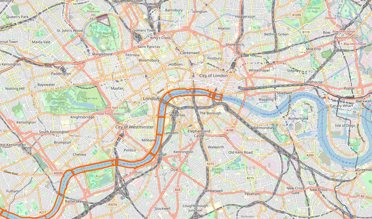
Now to render it, I simply need grab all the referenced ways, concatenate them into a polygon, and draw it, right? Here is what happens when I do that:
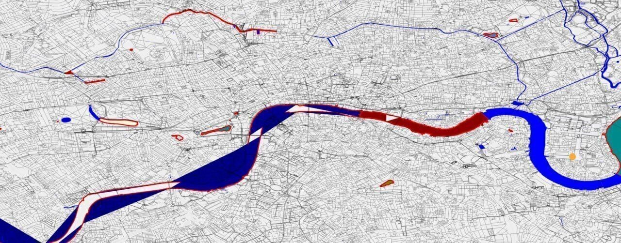
Sigh.
Let’s take a look at what’s happening. Here are the constituent paths of the multipolygons, drawn in different colours. The number associated with each segment shows at which index it appears in the definition of the relation.
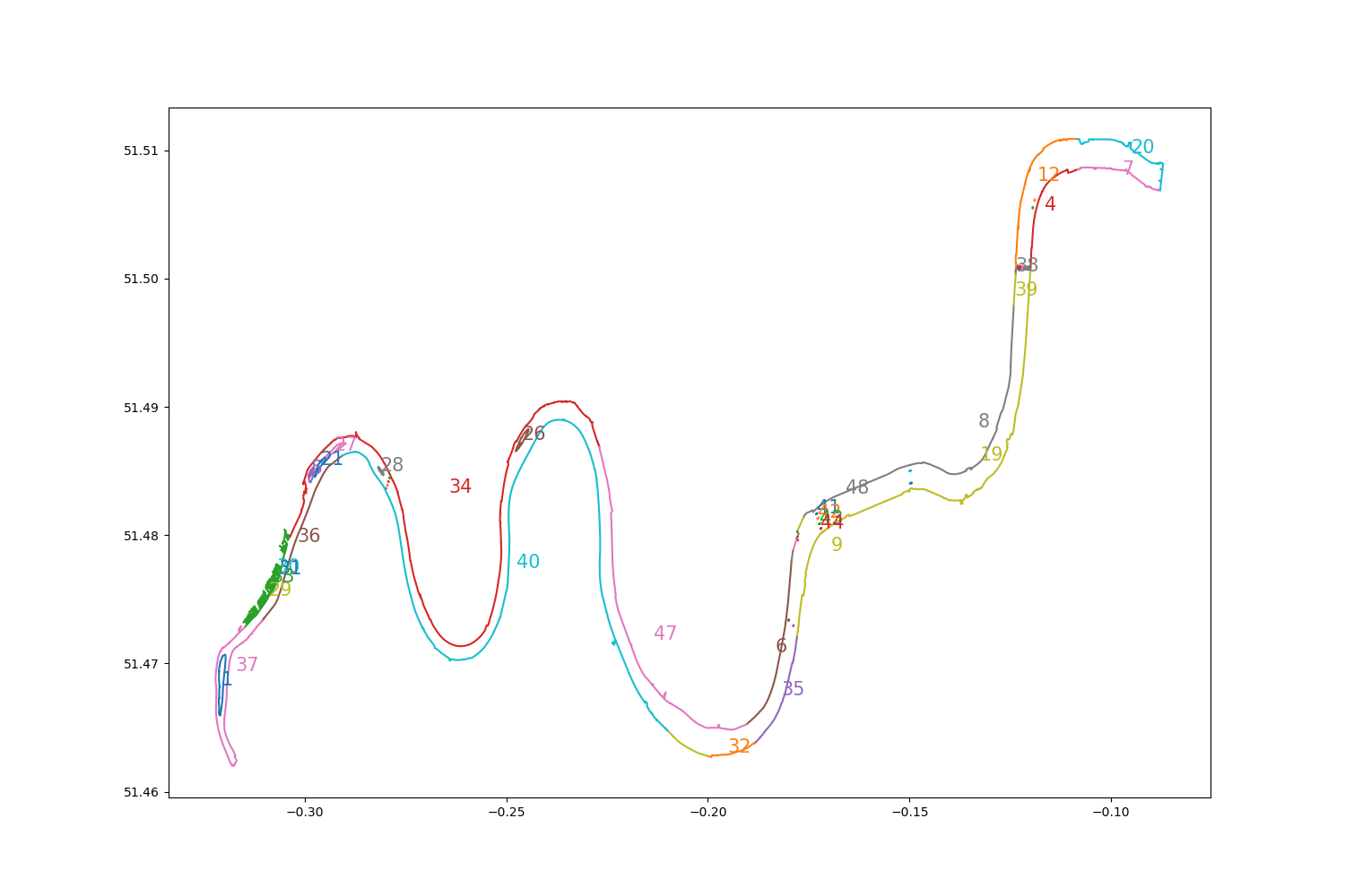
The rendering issue occurs because the ways constituting the relation are not in (geometrical) order. To display them correctly, I need to reorder them. The end node of one way always overlaps the start node of another, so this reduces to a simple search problem: For each way, we find a successor using a mapping from star and end nodes to ways. The actual implementation is very fiddly, because ways are sometimes “reversed”, so we need to pick a direction for the first way and normalize the other ways by flipping some of them.
See here for the python implementation. The code quality is roughly proportional to how motivated I felt to be solving a “simple search problem” when all I wanted to do was to draw a river.
But it works ¯_(ツ)_/¯.
With advanced multipolygons vanquished, everything else on the data side was smooth sailing.
Projection & coordinate maths
The OSM data are given in angular coordinates but I need to map them into pixel space. Then, these pixel space coordinates will be translated to centimetre space coordinates on my wall, when I print the image.
That’s simple enough, but what made it challenging was trying to find a way to create a bounding box in angular space and align it onto the map with the right zoom level and then do the translation into pixel space. Not challenging in a “There’s some cool maths here” sort of way but rather in a “There are many numbers here and I need to not lose track of what I’m dividing by what”.
There was a lot of faffing, which I will spare you. In the end I had two useful tools.
The first was the js-samples repo of the Google Maps JavaScript API, which has a convenient way of overlaying polygons over Google Maps.
I just needed to modify the snippet to say:
const lon_w = -0.297;
const lon_e =  0.108;
const lat_n = 51.599;
const lat_s = 51.410;

const triangleCoords = [
    { lat: lat_n, lng: lon_w },
    { lat: lat_s, lng: lon_w },
    { lat: lat_s, lng: lon_e },
    { lat: lat_n, lng: lon_e },
];
and plug in different values for my bounding box. After an initial npm run, it would autoreload on page refresh and was pretty smooth to work with.2
The second was to clarify in my head what inputs I had decided on and which outputs I needed. This looked something like this.
Inputs:
- DPI
- Width & Height in cm
- Centre in angular coordinates
- px / °lon and px °lat
Outputs:
- Angular coordinates of the top left corner of my bounding box
- Width and height in °lon and °lat
- Width and height in px
Once the problem is formulated like this, the calculations themselves were fairly trivial to plug into a spreadsheet.
The DPI number I eyeballed at 600 to make it “very high”, and for wall dimensions I chose 100x170cm based on my room. The map looked best if centred on St Paul’s at lat=51.51561°, lon=-0.09875°.
I picked 58325 and 93740 pixels per degree of longitude and latitude, respectively, but I sadly don’t remember why.3
I picked a Mercator projection because we’re too far from the poles for it to matter and it was easy to implement.
My biggest regret at this stage is not deciding to separate pixel and wall space in code. If DPI had
been a variable, and not something baked into the inputs to my code, I could have easily created low-fi
versions of the map quickly by setting the DPI down. As it is implemented, it’s impossible for me to adjust the DPI without
changing all the font sizes and scaling all the icons.
The Python approach and why it failed
So remember how I thought this would be a quick project? I decided to hack it together in python. The architecture was something like this:
I built an event-based streaming XML parser from Python’s xml.sax because I expected that
creating and storing a full DOM model of the XML in memory would not be fun4.
This architecture mostly worked fine, except that the RenderingParser accumulated a lot of
complexity because needed to both resolve nodes and ways by their references, and also figure out which semantic map
elements these raw entities correspond to (trees, rivers, roads, etc.).
A problem that I was quite taken aback by was how hard it was to convert SVGs into (large) PNGs. Most libraries I tried refused to create a PNG of the required size, and some crashed in ugly ways. Displaying an SVG with millions of entities was also a struggle and took around 3 minutes in Firefox, which was the best tool I could find at the time.
So I wrote a PILRenderer to render into PNG directly. This resolved the SVG crisis, but carried a heavy performance penalty. The reason I used SVG in the first place was
that I wanted to generate the rasterized image in native code. PIL has a C backend, of course, but there was a noticeable
decrease in performance by about 3x.
The PILRenderer carried me for a while, but rendering was taking up to a minute, even on small subsets of the map. I knew how many different types
of data I wanted to display and that there would be endless tweaks to colours and sizes etc, so I decided that the Python implementation was not fit for purpose.
So what to do if Python isn’t fast enough?
Rust rewrite as “ETL”

In hindsight I should have anticipated that this would exchange all my performance problems for Rust problems.
A lot oft things went right though. The new architecture splits out XML parsing, semantic element extraction, and drawing into three separate ETLs, which cache their intermediate results. The XML parsing took a couple of minutes, but thanks to cacheing I only had to do it about five times over the course of the whole project. I made the most changes to the drawing code, and each drawing run took about 20s, which was acceptable for smaller tweaks. The semantic extraction took another 20s, but I only had to touch that when I added a new kind of feature to the map (e.g. trees or tube lines).
Here is how the outputs of the first ETL was defined:
// Parsing the map data

#[derive(rkyv::Archive, rkyv::Deserialize, rkyv::Serialize, Debug, Default, Clone)]
pub struct OsmMapData {
    pub nodes: HashMap<OsmId, Node>,
    pub ways: HashMap<OsmId, Way>,
    pub relations: HashMap<OsmId, Relation>,
}

#[derive(rkyv::Archive, rkyv::Deserialize, rkyv::Serialize, Debug, Default, Clone)]
pub struct Node {
    pub id: OsmId,
    pub lon: f64,
    pub lat: f64,
    pub tags: HashMap<Vec<u8>, Vec<u8>>,
}

#[derive(rkyv::Archive, rkyv::Deserialize, rkyv::Serialize, Debug, Default, Clone)]
pub struct Way {
    pub id: OsmId,
    pub nodes: Vec<Node>,
    pub tags: HashMap<Vec<u8>, Vec<u8>>,
}

#[derive(rkyv::Archive, rkyv::Deserialize, rkyv::Serialize, Debug, Default, Clone)]
pub struct Relation {
    pub id: OsmId,
    pub ways: Vec<Way>,
    pub tags: HashMap<Vec<u8>, Vec<u8>>,
}
The structure is denormalised to simplify the code, which means that many nodes and relations are duplicated. It still fits comfortably into 16 GB of RAM so that was totally worth it.
#[derive(rkyv::Archive, rkyv::Deserialize, rkyv::Serialize, Debug, Default, Clone)]
pub struct SemanticMapElements {
    pub underground_stations: Vec<TransportStation>,
    pub rails: Vec<Path>,
    pub roads: Vec<Path>,
    pub areas: Vec<Area>,
    pub landmarks: Vec<Landmark>,
    pub tube_rails: Vec<TubeRail>,
    pub councils: Vec<Council>,
}

#[derive(rkyv::Archive, rkyv::Deserialize, rkyv::Serialize, Debug, Clone)]
pub struct Area {
    pub area_type: AreaType,
    pub area_polygons: Vec<Path>,
}

#[derive(rkyv::Archive, rkyv::Deserialize, rkyv::Serialize, Debug, Clone)]
pub enum AreaType {
    Park,
    Wood,
    Water,
}

#[derive(rkyv::Archive, rkyv::Deserialize, rkyv::Serialize, Debug, Clone)]
pub struct Landmark {
    pub lon: f64,
    pub lat: f64,
    pub landmark_type: LandmarkType,
}

#[derive(rkyv::Archive, rkyv::Deserialize, rkyv::Serialize, Debug, Clone)]
pub enum LandmarkType {
    CocktailBar,
    ClimbingBoulder,
    Gym,
    Hospital,
    TempleAetheriusSociety,  // [Yes, I added icons for pretty much every religion featuring in the metadata]
    TempleBuddhist,
    ...
}
To free up memory in between stages, I got to use the rare standalone block expression.
// Limit ETL Scope so that memory can be freed as early as possible
{
    let mut parse_osm_etl = ParseOsmEtl::new(&user_config);
    parse_osm_etl.process(&output_dir)?;
}
{
    let mut semantic_map_etl = SemanticMapEtl::new();
    semantic_map_etl.process(&output_dir)?;
}
{
    let mut draw_map_etl = DrawMapEtl::new(&user_config);
    draw_map_etl.process(&output_dir)?;
}

Ok(())
The biggest challenge was finding a way to generate PNGs at a high enough level of abstraction (i.e. not just writing numbers to a byte buffer & then encoding that as PNG). I decided to go with the raqote library, but that ended up causing me a lot of pain5.
Streaming parser V2
I used the Reader from quick_xml which while Very Enterprisy was still accessible. To construct a Reader from a gzip compressed file, I used this:
use std::io::{BufRead, BufReader, Write};
use xz::bufread::XzDecoder;
use quick_xml::reader::Reader;

fn create_osm_reader(&self) -> Result<Reader<impl BufRead>> {
    let file = fs::File::open(Path::new("..").join(&self.config.data_path))?;
    let file_reader = BufReader::new(file);
    let xz_reader =  XzDecoder::new(file_reader);
    let buffered_xz_reader = BufReader::new(xz_reader);
    let mut reader = Reader::from_reader(buffered_xz_reader);
    reader.trim_text(true);

    Ok(reader)
}

loop {
    reader.read_event_into(&mut buf) {
        ...
    }
    buf.clear();
}
Speeding up serialization using rkyv
Initially I would save down the outputs of each ETL using serde, which is the default option for rust serialization. This was not performant enough: loading a serialized representation of the map took around a minute. However I found this:
But just having design goals isn’t good enough, you need results to back them up. With that in mind, I can’t disclaim enough that I am the creator and maintainer of rkyv. However, the last thing I want is to be biased, so I made some benchmarks to hopefully convince you on their own merits.
In other words: “I wrote the fastest serialization framework out there, and to prove it I also built the best serialization benchmark.” Read the whole thing, it has the scent of competence.
Switching to rkyv reduced my load time to a ridiculously low number.
Converting the polygon reordering alg to Rust
For the rust rewrite, I needed to implement Advanced Multipolygons again. Thankfully, by this point AI had happened, so I asked it to rewrite my python monstrosity in Rust. After a few tweaks I got it to compile, at which point it Just Worked. It’s not nice code, but then, neither was the original. Here is the whole thing in case you want to see what contortions are necessary to translate a Python snippet into Rust verbatim.
Improving rendering time in raqote
At some point in the process I noticed rendering times were getting quite large and I decided to run perf on the whole thing, hoping it would lead me on a
purplesyrigna style adventure. What I found instead was that most of the time was spent compressing the output PNG, which was 1.3 Gi
in size. The compression code was already SMID optimized, so I didn’t expect to be able to pick any low-hanging fruit. The correct solution here would have been to switch to uncompressed TIFF or something,
but honestly at this point I was starting to get a bit fed up with the whole thing, and onboarding any Rust library feels like a Project, so instead I found a go-faster-button and pressed it. I cloned raqote locally and made the following change:
+++ b/src/draw_target.rs
@@ -1101,28 +1103,35 @@ impl<Backing : AsRef<[u32]> + AsMut<[u32]>> DrawTarget<Backing> {
         let mut encoder = png::Encoder::new(w, self.width as u32, self.height as u32);
         encoder.set_color(png::ColorType::Rgba);
         encoder.set_depth(png::BitDepth::Eight);
+        encoder.set_compression(png::Compression::Fast);
I then pointed my local map project to the local repository, and it did in fact go faster.
diff --git a/rust_rewrite/Cargo.toml b/rust_rewrite/Cargo.toml
-raqote = "0.8.3"
+raqote = { path = "../../raqote" }
Fixing font rendering in raqote
At some point I decided that I wanted to include the names of tube stations on the map. For a while I thought I would have to figure out glyph shaping and layouting on my own,
but apparently raqote already supports text rendering out of the box. I picked a nice font from Google fonts, and set about trying to
getting it rendered with raqote. I loaded the font with font_kit
let font = font_kit::loader::Loader::from_file(
    &mut std::fs::File::open("resources/fonts/Domine-Bold.ttf").unwrap(), 0
).unwrap();
and tried drawing some tube labels with draw_text. Then this happened:
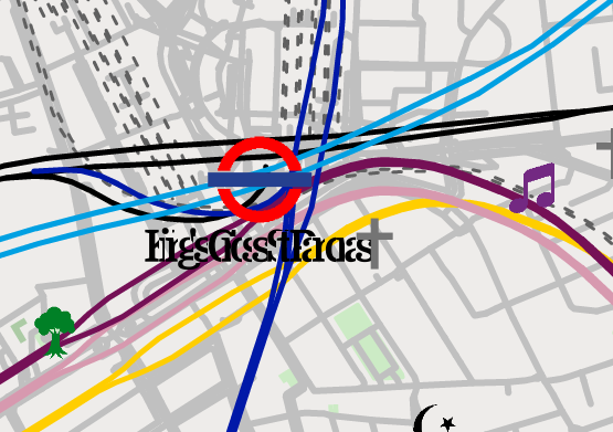
I don’t fully understand why. I took a look at the code:
pub fn draw_text(
    &mut self,
    font: &fk::Font,
    point_size: f32,
    text: &str,
    start: Point,
    src: &Source,
    options: &DrawOptions,
) {
    let mut start = fk::vec2f(start.x, start.y);
    let mut ids = Vec::new();
    let mut positions = Vec::new();
    for c in text.chars() {
        let id = font.glyph_for_char(c).unwrap();
        ids.push(id);
        positions.push(Point::new(start.x(), start.y()));
        start += font.advance(id).unwrap() * point_size / 24. / 96.;
    }
    self.draw_glyphs(font, point_size, &ids, &positions, src, options);
}
I noticed the magic constant 24. / 96..
What if…
…it was 24. / 96. * 2. instead? I copied the bit of code into my code base, mutatis mutandis, and added a multiplier.
diff --git a/rust_rewrite/src/etl/draw_map.rs b/rust_rewrite/src/etl/draw_map.rs
-        start += font.advance(id).unwrap() * point_size / 24. / 96.;
+        start += font.advance(id).unwrap() * point_size / 24. / 96. * 2. * fk::vec2f(point_size * letter_spacing, 0.0);
In addition to multiplying by 2, I also made letter spacing in the x dimension parametric, so that I could get different effects for different inscriptions.
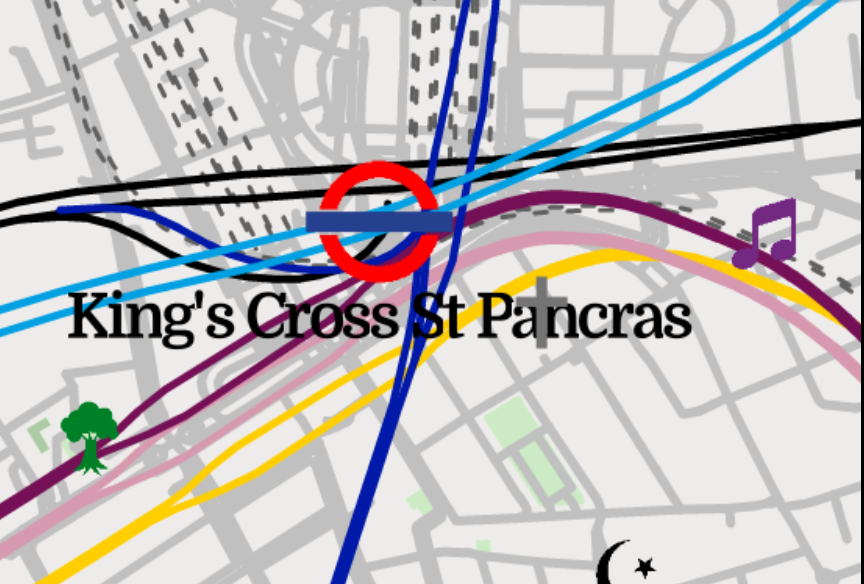

As many things map, this solution isn’t nice, but it does the trick.
Configuring raqote colours in a json config
One thing I did in preparation for the final colour tweaking was to put all the colour settings in a config file:
"theme": {
    "background_color": "#eeeceaff",
    "park_color": "#ccebc5ff",
    "wood_color": "#accba5ff",
    "rail_color": "#606060ff",
    "road_color": "#c0c0c0ff",
    "text_color": "#000000ff",
    "council_name_color": "#646464ff",
    "water_color": "#b3cde3ff"
}
The config model was implemented with serde but I wanted to parse the hex strings directly into a raqote SolidSource.
The serde interface to do that is very clean, but not very intuitive.
First I define the serde model as usual, and specify a custom deserialisation function.
#[derive(Deserialize)]
pub struct Theme<'a> {
    #[serde(deserialize_with = "deserialize")]
    pub background_color: Source<'a>,

    #[serde(deserialize_with = "deserialize")]
    pub park_color: Source<'a>,

    // ...
}
In the same module, I define deserialize, which constructs a raqote::Source::Solid from the output of deserializer: D. D is a type specific to
the serialized representation of the data (json, xml, etc.). Its output is determined by a Visitor, which we provide. D is generic in a lifetime,
but we can simply make deserialize take a generic lifetime argument and pass that in.
use raqote::{SolidSource, Source};
use serde::{de, Deserializer};

pub fn deserialize<'de, 'a, D>(
    deserializer: D,
) -> Result<Source<'a>, D::Error>
    where D: Deserializer<'de>, 'a: 'de {
    Ok(Source::Solid(deserializer.deserialize_str(ColorVisitor)?))
}
I define an empty struct ColorVisitor and implement the Visitor trait for it. We make ColorVisitor take a lifetime argument, and pass
it into Visitor. I also specify that the return type will be a SolidSource.
I implement visit_str, check that the length is correct, and pass the correct pairs of characters into a helper function6.
use raqote::{SolidSource, Source};
use serde::{de, Deserializer};
use serde::de::Visitor;

struct ColorVisitor;

impl<'de> Visitor<'de> for ColorVisitor {
    type Value = SolidSource;

    fn expecting(&self, formatter: &mut std::fmt::Formatter) -> std::fmt::Result {
        write!(formatter, "a hex colour string like #AABBCCFF")
    }

    fn visit_str<E>(self, string: &str) -> Result<Self::Value, E> where E: de::Error {
        if string.len() != 9 {
            return Err(de::Error::invalid_value(de::Unexpected::Str(string), &self))
        }
        let r = parse_hex_byte(&self, &string[1..3])?;
        let g = parse_hex_byte(&self, &string[3..5])?;
        let b = parse_hex_byte(&self, &string[5..7])?;
        let a = parse_hex_byte(&self, &string[7..9])?;
        Ok(SolidSource::from_unpremultiplied_argb(a, r, g, b))
    }
}
Finally parse_hex_byte is a function that turns the string "FA" into the unsigned byte 250. If it fails, it returns one of the
pre-defined serde errors.
fn parse_hex_byte<E>(visitor: &ColorVisitor, string: &str) -> Result<u8, E> where E: de::Error {
    u8::from_str_radix(string, 16).map_err(|_| {
        de::Error::invalid_value(de::Unexpected::Str(string), visitor)
    })
}
That’s a fair bit of boiler plate, but in principle this can now decode hex strings from any string based format out there, and it also gives great error messages. That’s nice, even though of course I don’t actually need any of these things.
Rendering non-overlapping tube lines
In order to keep things manageable, I decided early on that I would keep manual adjustments of the map to a minimum. This becomes a challenge when trying to visualize the tube system clearly. The OSM dataset contains the exact positions of all tube tunnels and rails, giving much better intuition for where the stations are in relation to each other. Whereas the official TFL map is optimized for readability. I can’t find the reference for it, but I remember reading that the TFL map is laid out manually, and that it takes a lot of work (which, in retrospect, didn’t bode well for the scope of my project, where having reasonably laid out tube lines was just a tiny part of the whole thing).
The problem with the physical layout derived from OSM data is that tube lines sometimes share tunnels (to within the resolution of OSM mapping, at least). See this fragment where District, Hammersmith & City, Circle, and Metropolitan lines (Green, Pink, Yellow, and Purple, with Yellow completely hidden) are all drawn over each other.
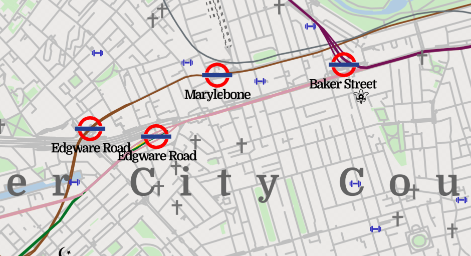
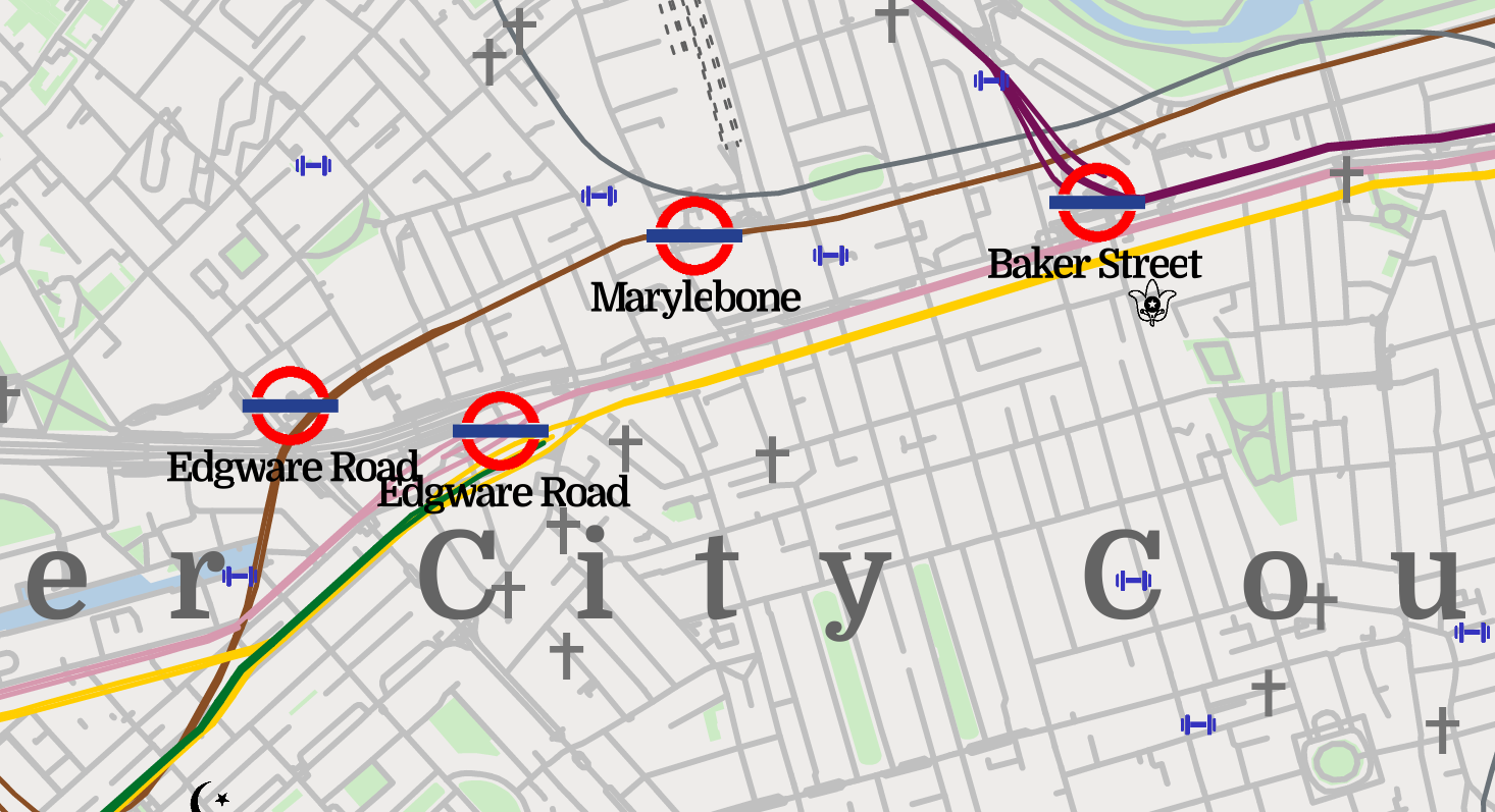
The solution I went with was to shift all lines slightly to the side by a constant offset. The offset vectors for the lines were evenly spaced on the unit circle. This way, for each pair of lines, there is only one direction at which lines which share a tunnel will overlap (the direction parallel to the sum of their offset vectors):
fn draw_tube_rail(&self, dt: &mut DrawTarget, tube_rail: &semantic::TubeRail) {
    fn wiggle(n: u64, n_max: u64, r: f64) -> (f64, f64) {
        let angle = (n as f64) / (n_max as f64) * f64::consts::TAU;
        (angle.cos() * r, angle.sin() * r)
    }

    // ...

    let offset_radius = 30.0;
    let (dx, dy) = match tube_rail.line {
        semantic::TubeLine::Bakerloo => wiggle(0, 14, offset_radius),
        semantic::TubeLine::Central => wiggle(1, 14, offset_radius),
        // ...
        semantic::TubeLine::WaterlooAndCity => wiggle(13, 14, offset_radius),
    };

    // Draw the map, shifted by (dx, dy).
I deeply appreciate that rust has Tau as a constant in the standard library. It took some tweaking of the order on the circle to make sure the overlap didn’t happen anywhere where it didn’t look nice. Here is the end result. All four lines are visible now, even though the District and Circle lines are close to their worst possible angle (note that this branch of the green District line terminates at Edgeware Road).
Overflow bugs and tiling / Icons by loading a PNG by hand and dealing with obscure bugs
My biggest source of headaches by far was weird non-deterministic behaviour when drawing icons. Icons would appear only in some regions of the map. Icons would appear only if they contained at least one pixel that was not greyscale. Icons would sometimes get drawn as purple squares.
It turns out that the issue came from overflow bugs inside the raqote spline rastarization algorithm, which was using u32 coordinates,
together with a copious amount of bit shifts. My image, with the perfectly reasonable size of 58,325 x 93,740 pixels was causing it to overflow.
I noticed this when I tried running the program with debug symbols enabled. Previously I had consistently been running cargo with the --release flag, because of the
~100x performance improvement I saw. As soon as I dropped it, I would got out-of-bounds panics from within raqote.
After spending some time looking into the code, seeing if I can change it to use a bigger data type and submit a PR, I gave up. The algorithm had been ported from a different library, was very dense, and relied on the exact bit layout of some intermediate results it was storing.
So instead, after a long battle, I took the easy way out and generated 9 tiles, which were individually small enough to avoid overflow. I then stitched them together using a simple python script which the AI wrote for me. To my delight, and to raqote’s credit, the tile boundaries matched up perfectly.
Printing the map
The final step of this project was the actual physical printing. I went with WhiteWall, because they had enough technical documentation to make me trust them and because they offer prints in 400dpi.
The process was very simple, since they do the colour space conversion for you. I first printed off a proof on a normal ink jet printer, which allowed me to catch some font size issues and to decide on a colour scheme. I then ordered A4 photographic proof prints from WhiteWall, by simply uploading my generated files through their web portal. They offer to send proofs with a “photographic test print” watermark, at roughly a 50% discount. I disabled the “Image Enhancement” feature since I think it would mess with my carefully chosen colour scheme.
I ordered two proofs, which differed by some minor tweaks, mostly around the saturation of various icons. When they arrived, I almost couldn’t distinguish the two versions, so I concluded that I had reached marginal returns, took the plunge, and ordered the whole thing in full 100x70cm glory.
The only thing worth mentioning here is that the web interface for WhiteWall is not very intuitive. If I want a framed photographic print, I need to go via “Photo Prints”, and then add a frame at checkout. If I instead go to “Framed Prints”, I end up with prints on glass or aluminium, which cost upwards of 1.5x as much.
The cost of the proofs was £20, which I imagine is mostly due to very robust packaging. The cost of the framed full size print was £250.
Takeaways
I will ponder this project some more once I have more distance from it, and possibly write and publish a full retro. For now some initial thoughts:
- It’s really hard to find a software stack that confidently handles large images.
- Turning SVGs into large PNGs in a consistent manner is hard.
- “pixels_per_degree” is a terrible way to think about coordinates.
- It would have been nice to have a further layer of abstraction on the coordinate system, so that I could tweak DPI for iteration without changing all the icon sizes.
- I’m undecided whether or not rewriting in Rust was the correct call. I think in Python the length of iteration cycles would have been prohibitive. On the other hand, the friction involved in everything Rust related probably caused me to implement fewer features in the map than I would have with the perfect stack.
- A friend suggested OpenGL as a rendering stack. I think without a nice porcelan layer this would have been a pain, but I do wish I had gotten to see that alternate code base.
- I’m not sure why I was so catastrophically off in my time estimate for the project. Initially I thought 1-2 weekends, so about 10-20 hours. My lower bound for how far off I was is at least 5x. One factor was that when I started it I wasn’t working full time, and there were periods of multiple months where I wouldn’t work on the map at all, or work on other things. If there were any stakes at all in this, I would of course have actually done a formal, written estimation exercise. The next time I take on an ambitious project like this, I will start it with a written plan7.
- The OSM data set is awesome.
- It’s very motivating for a personal project to have a clear goal on the outset, and it doesn’t get more clear than DOD = “Hangs on my wall”. I will look for similar goals in other projects.
- Focusing so much of my time on one project was quite tiring. I didn’t measure exactly, but I think easily over 100 hours went into it, spread over 15 calendar months. While I did work on other things, THE MAP was the only bigger project I was working on.
- It is really nice to work on a technical project that I can explain to non-technical family and friends.
The map
You can download the map here and look at the full source code here. The map is released under a CC BY-NC-SA 4.0 International license.
If this writeup was useful to you in any way, let me know!
EDIT 2024-12-27: Fixing links and typos.
-
This is one of the reasons I did not include the new Overground line names. ↩
-
I later learned about python’s geopandas which might have been slightly more civilized than running a whole node server just to draw a box on a map in a given space. ↩
-
IIRC it was a mix of looking at the ratio between the two that other maps use and scaling a screen grab of OSM in GIMP until it looked right. I first “calibrated” my screen by creating a new empty A4 document and scaling out until the size on my screen was the same as the size of a random A4 sheet of paper I was holding up. I wonder if graphics designers just know this stuff or if there is a similar amount of faffing involved. ↩
-
This Stack Overflow answer gives an overview that is much more readable than the
xml.saxdocs themselves. ↩ -
As with OSM, I’m not knocking raqote here. It covers a lot if ground and I was clearly working way outside its intended use case. They are a volunteer effort and I’m grateful for being able to build off of their platform. ↩
-
You might have noticed that I don’t validate that the 1st character is a
#. I also just noticed that. ↩ -
Incidentally, I have found it useful to start a blog post about a project as I start the project, and document stuff I find out as I go along. I don’t think any of these are published yet, but it often helps me understand things better. ↩
